Visit the shop to buy this issue’s print edition or poster!

The past year was a historic one for many reasons, most of them unpleasant, and I’m using this issue of Plus Equals to mark the moment and create an opportunity for reflection. I’ll get into the specifics shortly, but first, let’s take a step back and talk about how photographs are created and reproduced. We’ll stick to black and white photography to keep it simple.
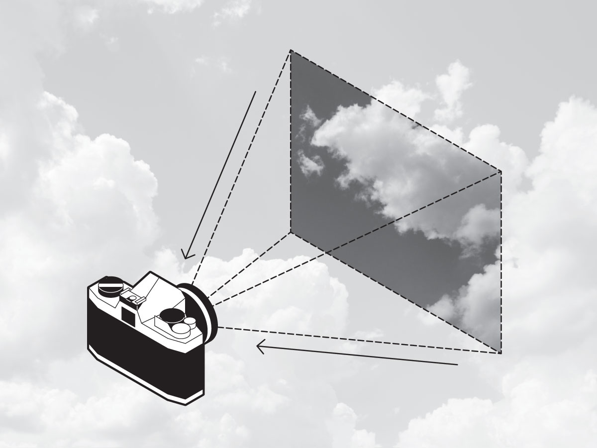
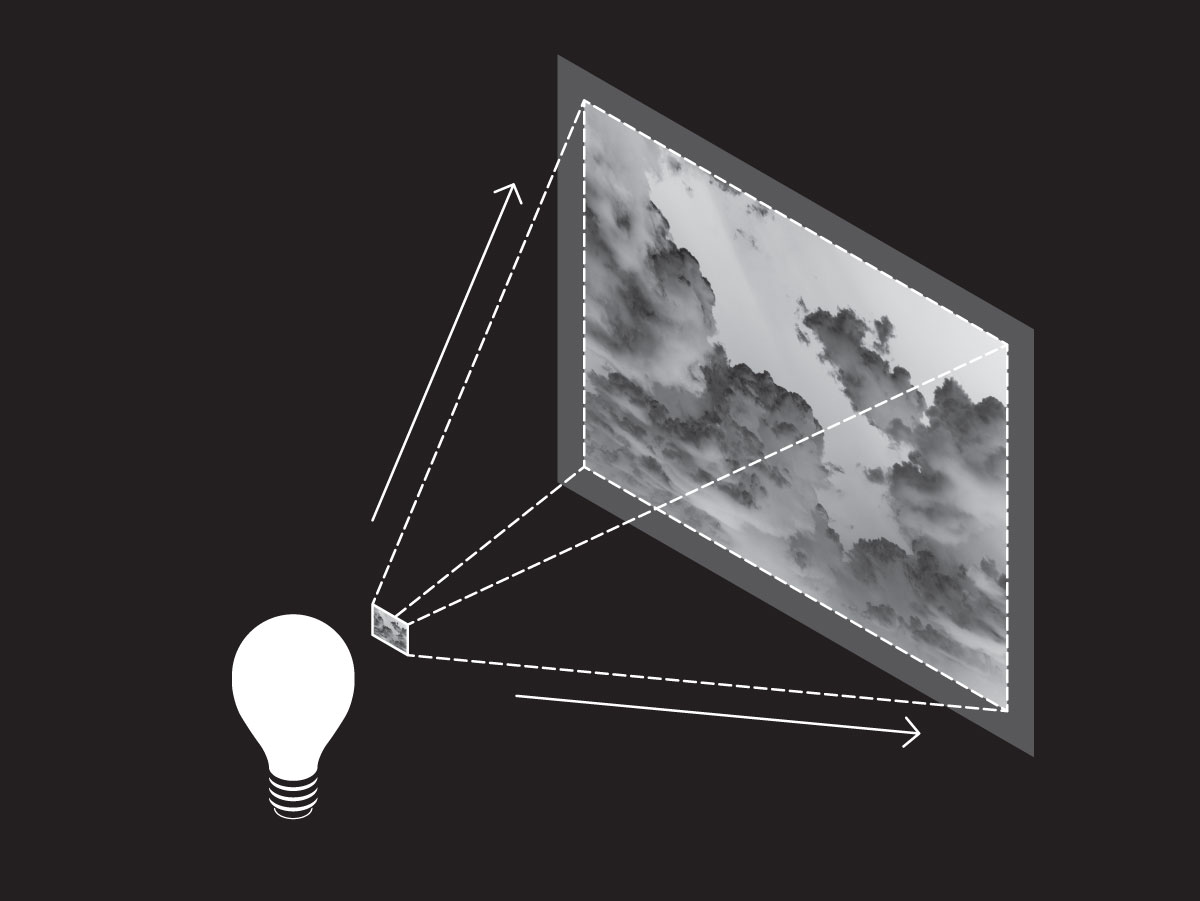
In traditional photography, a camera is loaded with film, a thin strip of transparent plastic coated with a light-sensitive emulsion. The photographer points the camera at the object whose image they want to capture, and when they press the shutter button, the shutter momentarily opens to expose the film to the light (Fig. 1). Later, the photographer develops the film by putting it in a chemical bath in a darkroom, which makes the exposed images appear on the film in reverse: the light areas are dark, and the dark areas are light. This is called a negative (Fig. 2). Finally, the photographer shines a light through the developed negative to project the image onto photographic paper, which, like the film, is coated with a light-sensitive emulsion (Fig. 3). As a result, the lights and darks captured by the paper are reversed again—back to their natural state—to create a print of the final image (Fig. 4).


Since this process is capable of printing high quality images, you’d be forgiven for assuming printed photographs are always reproduced this way, but that’s not the case. Photo paper is thick, expensive, and generally unsuitable for use in most mass-produced printed materials. In fact, the process used to print newspapers, magazines, and books is essentially a more sophisticated version of a rubber stamp, which can only print a solid ink color, not shades of that color. This works great for text and line drawings, whose color is flat, but what if you want to print a photograph with a rich tonal range? It could contain millions of shades of gray, and printing each of those shades with its own individual ink is unrealistic.
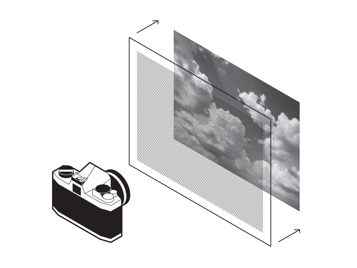
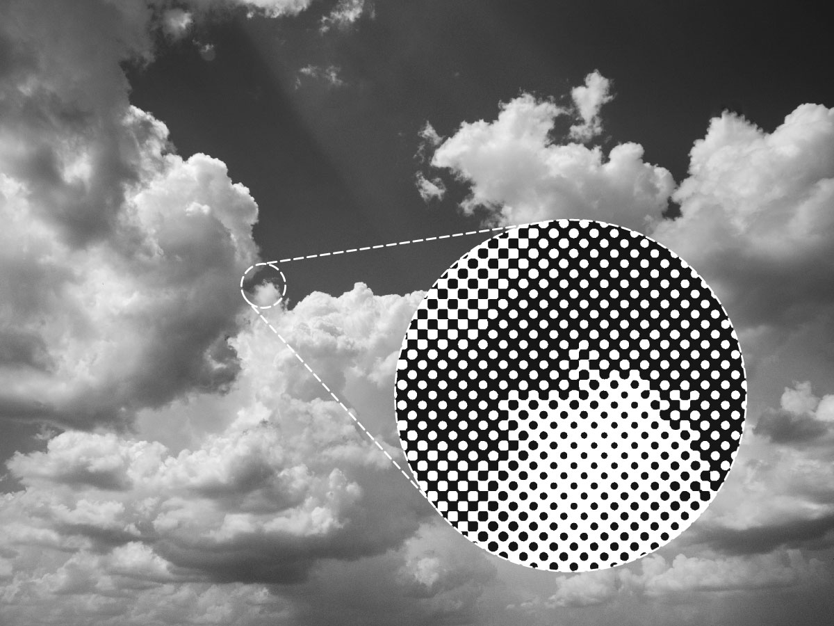
This is where the halftone process comes in. To reproduce those shades of gray (called “continuous tone” in the printing world) with a single ink color, the original photo is rephotographed through a halftone screen, a sheet of glass with a finely ruled grid of black lines (Fig. 5). The film used this time is coated with a high-contrast emulsion that will only record black or white. As the light travels through the screen and onto the film, the image is captured as a vast matrix of black dots. The darker the area of the image, the denser the dots. Taken together, these dots trick the eye into thinking it’s seeing shades of gray when in fact only one color is present: black (Fig. 6). And voila! A continuous tone image is rendered in a single color, suitable for printing by a more sophisticated version of a rubber stamp.
Modern photography and print production processes are more digital than chemical, and physical halftone screens are rarely used anymore. But those tiny halftone dots are still at work in virtually every printed photograph we encounter, including full-color photos, which do some extra magic by using four inks instead of one.
I love halftones. Apart from the fact that they’re a brilliant innovation, which has yet to be substantially improved upon after over 150 years, I find them appealing both philosophically and aesthetically.
Halftones remind us that a complex concept is sometimes best understood by placing it on a spectrum between two simpler, more fundamental concepts. “This gray contains an equal amount of black and white.” “This jalapeño margarita is a little sweeter than it is spicy.” “Canada’s firearm-related death rate is three times that of Japan, but just one-sixth the rate of the United States.”
And halftones just look cool. When they’re enlarged or exaggerated for graphic effect, they give us a different lens through which to see photographs, abstracting them into decorative patterns, turning soft gradations into hard-edged textures. They’re an anachronism: a precursor to the Industrial Revolution that nevertheless seems computer-generated; a unique aesthetic bridging the organic, the mechanical, and the digital.
But making combinatoric generative art—as is my wont—with halftone imagery doesn’t have an obvious starting point. Combinatorics are concerned with finite systems, but halftone dots, reductive as they are, come in an effectively infinite number of sizes. To rein that in, I’ll incorporate another reductive technique, borrowed this time from digital imaging.
A digital image, displayed on the screen of a computer, mobile device, etc., is a grid of tiny squares called pixels. Like halftone dots, taken together, they trick the eye into thinking it’s seeing continuous tone. Unlike halftone dots, each individual pixel can be a different color (Fig. 7). A large, full-color digital image can be made up of millions of pixels and millions of colors. However, early computers didn’t have enough memory or file storage capacity to handle such data-intensive images. To compensate, images intended for these computers were rendered at low resolutions (fewer pixels) and with a limited palette (fewer colors). An efficient way to manage a limited digital palette is with something called indexed color, a kind of paint-by-numbers system for computers. Indexed color assigns a number to each color in the image’s palette, and each pixel is tagged with the number of its corresponding color (Fig. 8). (One example of an indexed color image file format that’s still in common use today is the irrepressible GIF.)
Since a halftone dot’s size corresponds to the shade of gray it represents—the darker the gray, the bigger the dot—I can limit the number of dot sizes by incorporating indexed color to limit the number of shades of gray (Fig. 9). This will give me a finite system to which I can apply some combinatorics. And within that finite system, I’m going to create variations of an image by rearranging the shades of gray in as many ways as possible.
I was pleasantly surprised to learn that the scope of possible rearrangements is a pretty simple matter of factorials. As Wikipedia explains, “the factorial of a non-negative integer n, denoted by n!, is the product of all positive integers less than or equal to n.” In other words, to find the factorial of n, do a series of multiplications beginning with n and working backwards through every integer before it, stopping when you reach zero. The result tells you how many distinct sequences are possible for a set of n objects. For example, if I’ve limited my image to four shades of gray, 4! = 4 × 3 × 2 × 1 = 24, which means my four shades of gray can be arranged 24 different ways.
To find out what those specific arrangements are, I can reuse the method I devised in Plus Equals #1 for finding all possible stacking orders for a deck of cards. The difference this time is, since I want each of my image variations to use the entire available palette, I only need the sequences that include the full deck of cards—or in this case, the full set of grays—and I can safely ignore the rest (Fig. 10).
The final process goes like this (Fig. 11): a) Take a grayscale digital image. b) Reduce its resolution and reduce its palette to a limited number of shades of gray. c) Assign each of the palette’s shades a number, and tag each of the image’s pixels with the number corresponding to its shade. d) Replace each of the palette’s grays with a halftone dot of corresponding size. e) Rearrange the palette’s numeric assignments in every possible sequence and render a new halftone image for each.
With the combinatoric system now established, all that’s left to do is settle on a source image and decide how many shades to include in the palette, the factorial of which will determine how many variations of the image are generated. Ideally the source image will have a rich tonal range that makes robust use of the full palette, making the visual distinctions between the generated variations readily apparent. But I also want the image, its subject, and its response to this process to communicate something beyond the particulars of its aesthetics, which brings us back to this issue marking the moment and creating an opportunity for reflection.
I’ve decided to use a six-shade palette to generate 720 variations of George Floyd. To my eyes, there’s a grotesque violence in the ways these variations distort Floyd’s image—a violence that’s resonant with his murder, with its place in the legacy of American slavery, and with the subsequent reckoning’s psychic toll on the nation over the past year. Amid the variations’ ordered chaos, the halftone dots themselves seem to invite conflicting interpretations of our sociopolitical reality. Is their binary black and white emblematic of insurmountable polarization? Is their variety of sizes and positions optimistic that diversity will prevail? Whatever you see in these images, and especially if you, like me, are an unwilling beneficiary of a racist system, I hope you agree that George Floyd and everything he represents are worthy of our prolonged gaze.

Rob Weychert
rob@robweychert.com
Visit the shop to buy this issue’s print edition or poster!