Visit the shop to buy this issue’s print edition or poster!

You wouldn’t know it from the monochromatic Plus Equals, but I spend a lot of time exploring the mechanics of color. And so my interest was piqued when Loscil and Lawrence English, two musicians whose ambient works I’ve long admired, released a collaborative album earlier this year called Colours of Air, with each of its songs named for a different hue, such as “Aqua,” “Yellow,” and “Violet.” These eight ethereal compositions are constructed from manipulated tones drawn from a 19th century pipe organ, and while the music isn’t as overtly synesthetic as the titles might suggest, comparing and contrasting the songs’ essential qualities to those of their namesake hues is an exercise that elevates the listening experience.
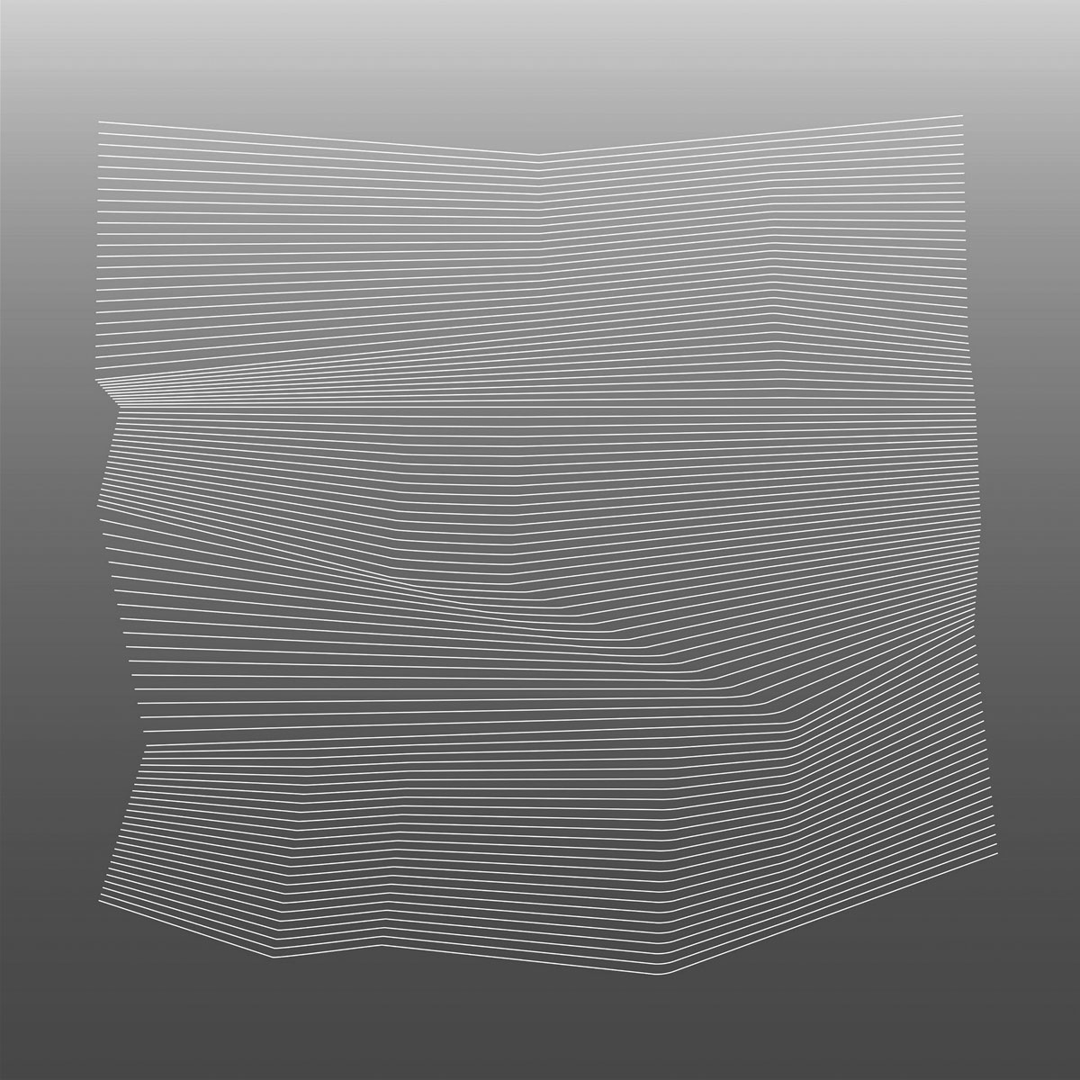
But before I even saw the song titles or heard the music, it was the album cover (Fig. 1) that immediately caught my attention. Designed by Scott Morgan (aka Loscil) and Craig McCaffrey, its background fades downward from a light pink to a deep magenta, atop which is a dense field of horizontal white lines whose various contortions subtly suggest folds in a piece of paper. I spoke with Scott over email about how he arrived at this image, and while his process was more subconscious than strategic, the result feels entirely representative of the music in some ineffable way.

I stared at it a lot, fascinated by how these simple, mechanical lines not only introduce an uncanny third dimension, but also evoke striations in muscle tissue, geological formations, and topographic maps. Inevitably, I wondered if a system could be extrapolated from it to generate variations, and I soon found a path forward.
One way to simplify what’s happening on the Colours of Air album cover is to think of it as a series of horizontal lines printed on a piece of fabric, where certain areas of the fabric are pinched and other areas are stretched. Approximating that effect in two dimensions begins with our old friend, the grid. If we take a simple grid (Fig. 2) and mutate it by pulling its intersections in various directions (Fig. 3), we can see a structure forming, something akin to the sort of wireframe that often gives papier-mâché objects their shape.
Adjusting it further, on each vertical line segment, we’ll add a uniform number of points that are equidistant from each other. On short segments, these points will be close to each other, and on longer segments, they’ll be further apart (Fig. 4). Once we add more horizontal lines by connecting those dots, we’re almost there (Fig. 5), and when we remove the vertical lines entirely, we have an image similar to the one from Colours of Air (Fig. 6).
This is a pretty good process, and we can make all kinds of interesting variations on this image by pulling the original grid intersections into different orientations. But for someone like me who prefers finite systems, it’s still too open-ended. Even though the grid itself is ostensibly a limitation, there’s currently no limit to the ways it can be mutated. To rein this in, we’ll give the base grid a sub-grid (Fig. 7). Now, we can insist that any manipulation of the base grid must align with the sub-grid (Fig. 8).
For the images I’ll be making, after some experimentation, I settled on a 4×4 base grid with a 32×32 sub-grid (plus an additional margin of six sub-grid units on each side). When the base grid intersections are manipulated, they’re only allowed to be pulled a maximum of two sub-grid units in any direction. This makes the range of movement for each base grid intersection a 4×4 area on the sub-grid, a tidy microcosm of the 4×4 base grid (Fig. 9).
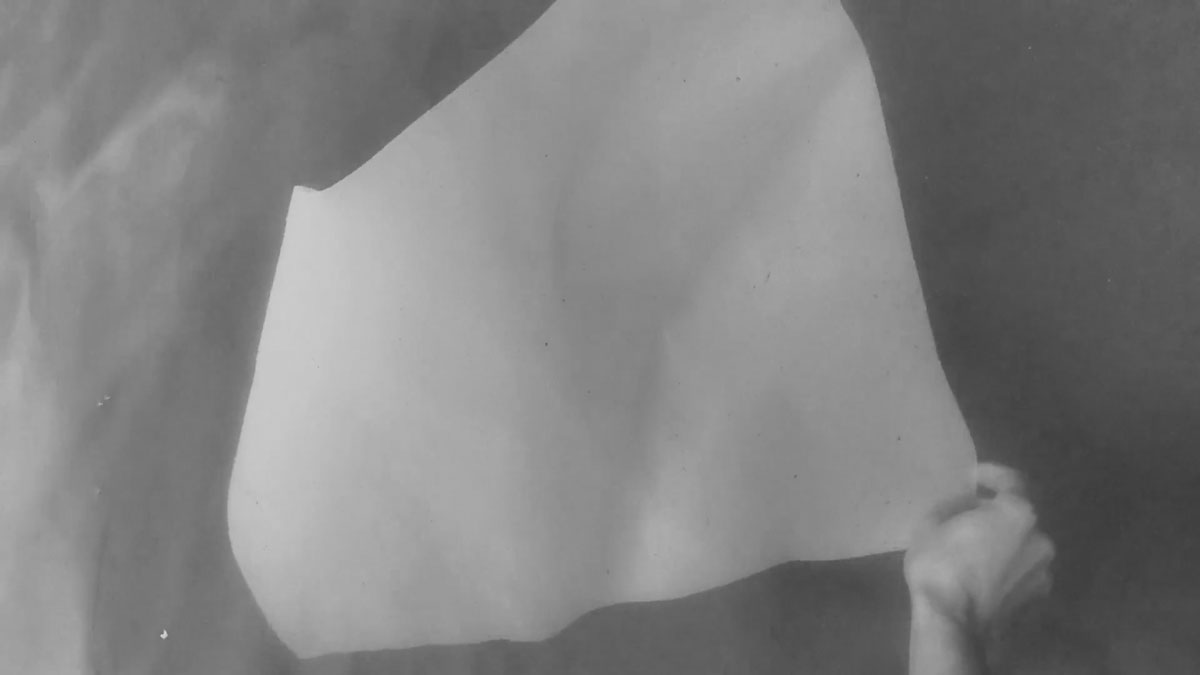
Also, inspired by a video by the artist Leah Mackin, in which she records the movement of a sheet of paper in a body of water (Fig. 10), I decided to convert my jagged lines to curves (Fig. 11). (See Plus Equals #6 for a crash course in Bézier curves.)

Within this system, I describe each manipulated base grid intersection by what I’m calling its deviation coordinates—that is, the distance it has moved from its initial position on the x and y axes, measured in sub-grid units ranging from -2 to 2. Since there are 25 base grid intersections (Fig. 12) and 25 possible pairs of deviation coordinates (Fig. 13), each intersection can be given unique deviation coordinates, with every possible pair of coordinates accounted for. From there, if I determine every possible sequence of those 25 pairs of deviation coordinates, the image variations that result—which I affectionately refer to as mutations—will be a complete set, representing the entirety of what this system can produce. (See Plus Equals #2 for information on factorials and how I’ve previously tackled the problem of comprehensive sequencing.)
But I’m not out of the woods yet. While this system may seem to have reasonable constraints, it still produces more than 15.5 septillion mutations. That’s a number with 26 digits! If each mutation were a square inch, the full set could cover the entire surface of the Earth more than 19 million times. It’s nearly 2 quadrillion mutations for every single person on the planet. If you lived to be 100 years old and looked at one mutation per second, it would take you almost 5 quadrillion lifetimes to see them all. In short, it’s a large enough number to be indistinguishable from infinity.
I tried including several additional systemic constraints to reduce that number. One is a sort of bilateral sudoku, which insists that in each row and column of the base grid’s intersections, deviation coordinates can’t repeat x or y values (Fig. 14). Alas, it seems to require more than enough calculations to melt my computer.
Another is radial symmetry, which only allows mutations that look the same when rotated 180 degrees (Fig. 15). It narrows things down considerably, but still produces a hefty 479 million results.
Ultimately I wasn’t able to find a way to get the number of results down to a human scale without either making unacceptable aesthetic sacrifices or making the system conspicuously convoluted.
As I said in the very first issue of Plus Equals, what I like about a combinatorial approach to algorithmic art is the creation of a system whose many possible results are all interesting, both individually and as a set. This is something of a collectivist ethos, in that the individual results are best appreciated in the context of the full set and the system that produced it. Crucially, it also allows the system to be its own curator. But since I like this particular system so much even though I can’t seem to sufficiently tame it, I decided to compromise and narrow down its cosmic scope by taking the final curation process into my own hands.
So I built an app that generates random mutations one at a time—either asymmetrical or radially symmetrical—and lets me sort them into “yes” and “no” piles. For each sorting session with the app, I tried not to think about it too much, letting instinct decide which variations were selected and which were rejected, continuing until I had 60 variations in the “yes” pile. Over the course of a few days, I did five sessions each with symmetries and asymmetries, yielding a total of 600 selections and 5,148 rejections. I then reduced those 600 selections down to a final 60 symmetries and 60 asymmetries.
When I look at my collected selections and rejections, some patterns emerge. The rejections have a habit of being too dramatic or too subtle, with bulbous curves and sharp angles at one end of the spectrum (Fig. 16), and uniform density and plain contours at the other (Fig. 17). The selections, on the other hand, are to my eyes more elegant and balanced (Fig. 18). They’re a showcase of quiet interplay between inquisitive curves and declarative horizontals, landing in formations that feel both entropic and composed, punctuated by dense areas suggesting shadows cast by an unknowable network of light sources.
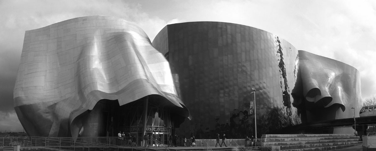
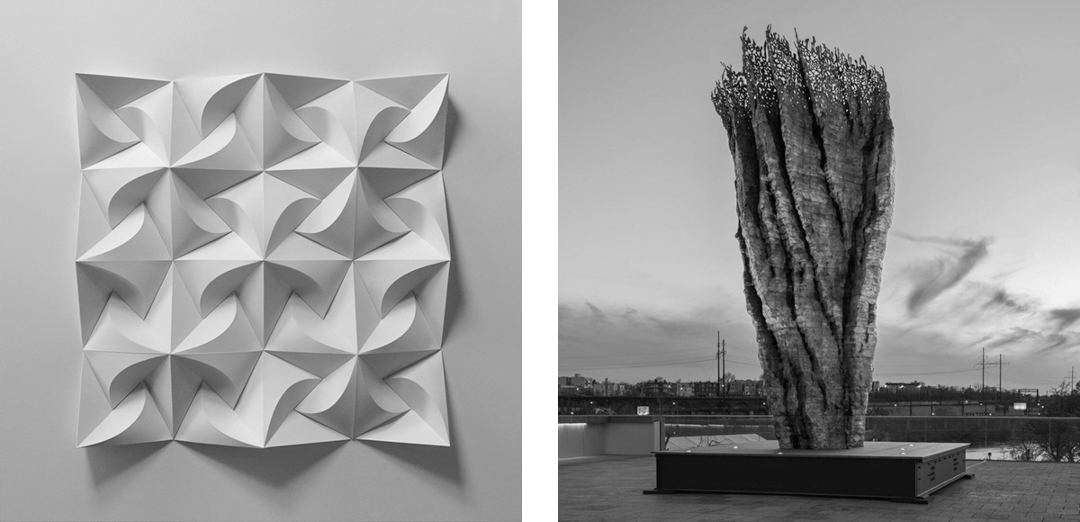
It’s not hard to see in them formal similarities to the work of some artists I admire, with Frank Gehry’s unmistakable architecture (Fig. 19) as the most well-known reference point. Some of the symmetries bring to mind the transcendent geometry of Matt Shlian’s paper relief sculptures (Fig. 20), which have fascinated me since I first discovered them in a gallery last year. Meanwhile, some of the more top-heavy asymmetries remind me of Ursula von Rydingsvard’s towering sculptures resembling craggy rock formations (Fig. 21), which I’ve been lucky enough to have easy access to while living in Brooklyn and Philadelphia.


As an artist who mainly thinks and works in two dimensions, these sculptural and architectural reference points are a pleasant surprise. And the patterns of desirable and undesirable attributes seen in the selected and rejected mutations offer clues to how I might further tune the system for higher quality and lower quantity. But for now, my curiosity is satisfied enough to leave that pursuit for another day.
Rob Weychert
rob@robweychert.com
Visit the shop to buy this issue’s print edition or poster!
